Creating a Tableau business dashboard and learning some awesome viz tips
I haven’t written a data viz blog in a while but I’m really excited to talk about my latest business Tableau dashboard. I’ll then share three helpful Tableau tips I learned from this data viz exercise. I learned one of the three tips from my incredibly talented friend, Tom O’Hara (Tableau Public | Twitter) who is a Lead Analyst on the Data Visualization team at Comcast. Tom’s dashboard tip was a huge life-saver for a Tableau project I was working on at work.
Let’s jump to it!
For this simple business data viz exercise, I built a business-related Tableau dashboard using fake NPS data. I only have one other business dashboard and it looks at Twitch’s streaming / hours data. I was ecstatic when I found out later that my Twitch business dashboard got ‘Viz of the Day’ (VOTD).
These last few weeks, I have been looking for some interesting data sets that mirrors the kind of work I do at Comcast like analyzing survey metrics for some of my data viz projects.
I discovered on the Storytelling with data blog, Cole Nussbaumer Knaflic had posted an interesting and fun “let’s give this slide a makeover” dashboard exercise and the data was on customer feedback analysis. I highly recommend exploring all the great resources and blogs on Storytelling with data. There is a lot that you can learn from Knaflic’s blogs and her team’s incredible works.
After refreshing my memory of containers by watching Andy Kriebel’s “Mastering Containers” video, I did a full makeover of the Customer Feedback Analysis dashboard exercise in Tableau.


The Customer Feedback Analysis dashboard includes a snapshot of NPS overtime, NPS category breakdown %, total number of comments by NPS category, and the number of promoters and detractors comments.
Colors
My go-to color palette resource is colorhunt. There are so many other sources out there for color great choices but I always go here to pick out my color palettes for work and personal Tableau vizzes. My favorite color palette collection is “Dark” and you might recognize that I have used some of these color palettes for my other Tableau vizzes.


Now I am really excited to share the 3 tips I learned from this business dashboard exercise. These tips will most likely be very familiar to you already and it’s all what I learned from the Tableau community!
I just thought it would be nice to bring them up again in this blog since I use these tips so often at work for my Tableau dashboards.
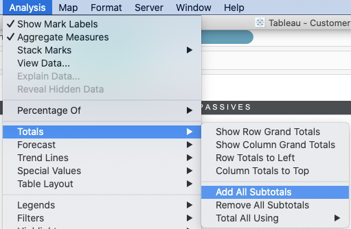
Tip #1: Add subtotals to create breathing room between categories on a bar chart
While working on this business dashboard exercise, I didn’t like how the bars by comments / no comments for each of the 3 categories (detractors, passives, and promoters) were so close to each other.
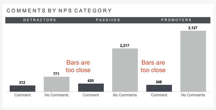
Instead, I added subtotals to the bar chart and shaded the subtotals white so it doesn’t show. By doing so, I was able to create more breathing room, additional white space, between the three NPS categories:
- Go to Analysis => Totals => Add all Subtotals
2. Drag over the [Comment?] field to the color shelf. Apply a white shade to the “Total” bar so it disappears.


3. Get rid of the “Total” label on the bar axis. Right-click on “Total” on the bar axis, go to Format (Header), and select the color White for the label text.


Bar chart with subtotals to create more breathing room, white space, between NPS categories:

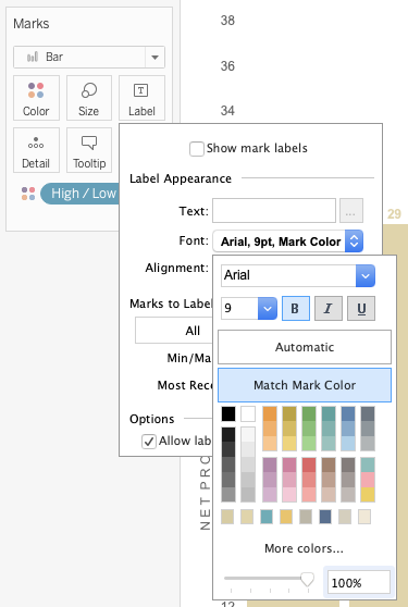
Tip #2: Match mark color
I use this tip all the time at work and love it. It’s so simple and easy. This tip has been around for a while too. In the bar chart below, I wanted my labels to match the color of the highlighted bars.

Simply go to “Label”, select the drop down arrow for the font option, and choose “Match Mark Color”. I use this tip for a lot of my work vizzes.
Tip #3: Adjusting your Tableau dashboard size to fit on letter landscape PDF
A few weeks ago, I struggled with fitting my dashboard onto a letter landscape PDF. At work, I am always asked to PDF dashboards, and most of the time, my stakeholders want the dashboards to fit on letter landscape.
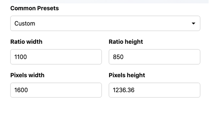
My great friend, Tom O’Hara (Tableau Public | Twitter) shared an awesome tip with me where I can use an Aspect Ratio dashboard sizing website to get my massive 1,600 pixels width Tableau work dashboard to fill up the whole letter landscape PDF.
The trick is to type in the ratio (w x h) for letter landscape on the aspect ratio website (https://calculateaspectratio.com/).
Letter landscape: Ratio width = 1,100; Ratio height = 850.
Once you entered the letter landscape ratio width and height, type in the pixels width of your Tableau dashboard.
In my example, it was 1,600 for pixels width. The pixels height will automatically adjust and give you the pixels height number you need to use on your Tableau dashboard. Once you have the pixels width and pixels height, try the PDF export option from Tableau and see how it looks. [Note: Also ensure that your Page Setup Margins for your Tableau Dashboard are set to zero — see screenshot below]
Thank you!
I hope you enjoyed this blog and please let me know if you have any questions. I have included links to the mentioned blogs and resources below.
Resources / Blogs:
“let’s give this slide a makeover” — Storytelling with data
“Mastering Containers” — Andy Kriebel
Colorhunt.com (Color Palettes)